
Static Ads Examples: 15 Formats Supplement Brands Use
A static ad is one image: the product, a line of copy, sometimes an offer. No motion, no sound. For supplement brands that makes statics the fastest way to test a new message. You can make ten in the time one video takes, see which line people respond to, then build the video around the winner.
This guide covers 15 static ad formats supplement brands use, grouped by the job each one does. For each format you get what goes on the image, how to design it, and where claims usually go wrong. If you want real ads from brands like AG1, Seed and Ritual, see our supplement ads guide.
What are static ads
Static ads are single-image ads with no motion. One frame has to stop the scroll and make its point at a glance. On Meta they run in Facebook and Instagram feeds, Stories, Reels and the right column. On Amazon they run as Sponsored Brands and Sponsored Display images.
Every static has three parts: the image, the words on the image, and the copy around it (primary text, headline, description). The image and the words on it do most of the work, because many people never read the caption. Write the on-image line first, and treat the caption as backup.
Why supplement brands are running more statics
They are fast to make. A static takes hours, a video takes days. That means more messages tested every week, and less money spent finding out an angle does not work.
They tell you what to film. A static that wins tells you which line, benefit or offer deserves a video next. Testing the message in a still first is cheaper than reshooting a video.
Supplements suit them. The product is simple to show, the pack carries the format and the dose, and one frame is easier to keep inside approved claims than a 30-second edit.
Statics do not replace video. Video is better at introducing a problem and showing a product in use. Statics are better at testing messages, answering doubts and closing. Most accounts need both: one media buyer who manages large Meta accounts wrote in January 2026 that most accounts he runs are 60 to 70 percent statics, and that your own results should set the mix.
Static ads that introduce the product
These formats work for people who have not met the brand yet. Each one gives a single reason to look twice.
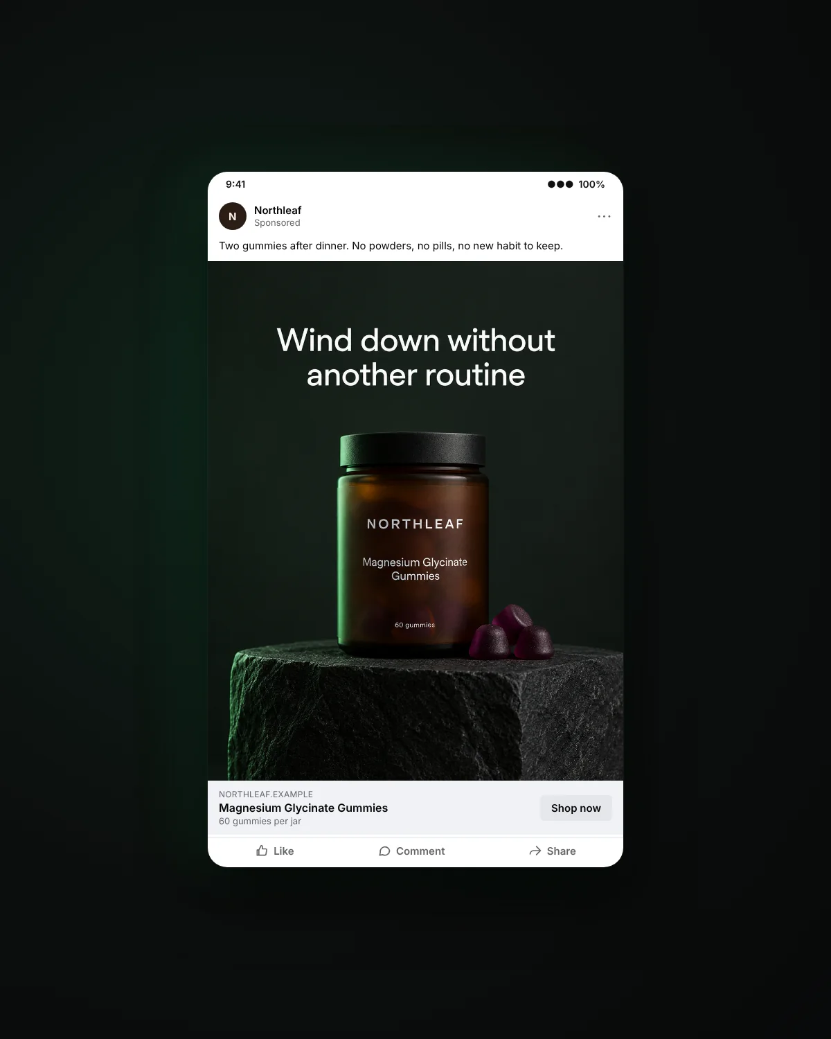
1. Benefit callout
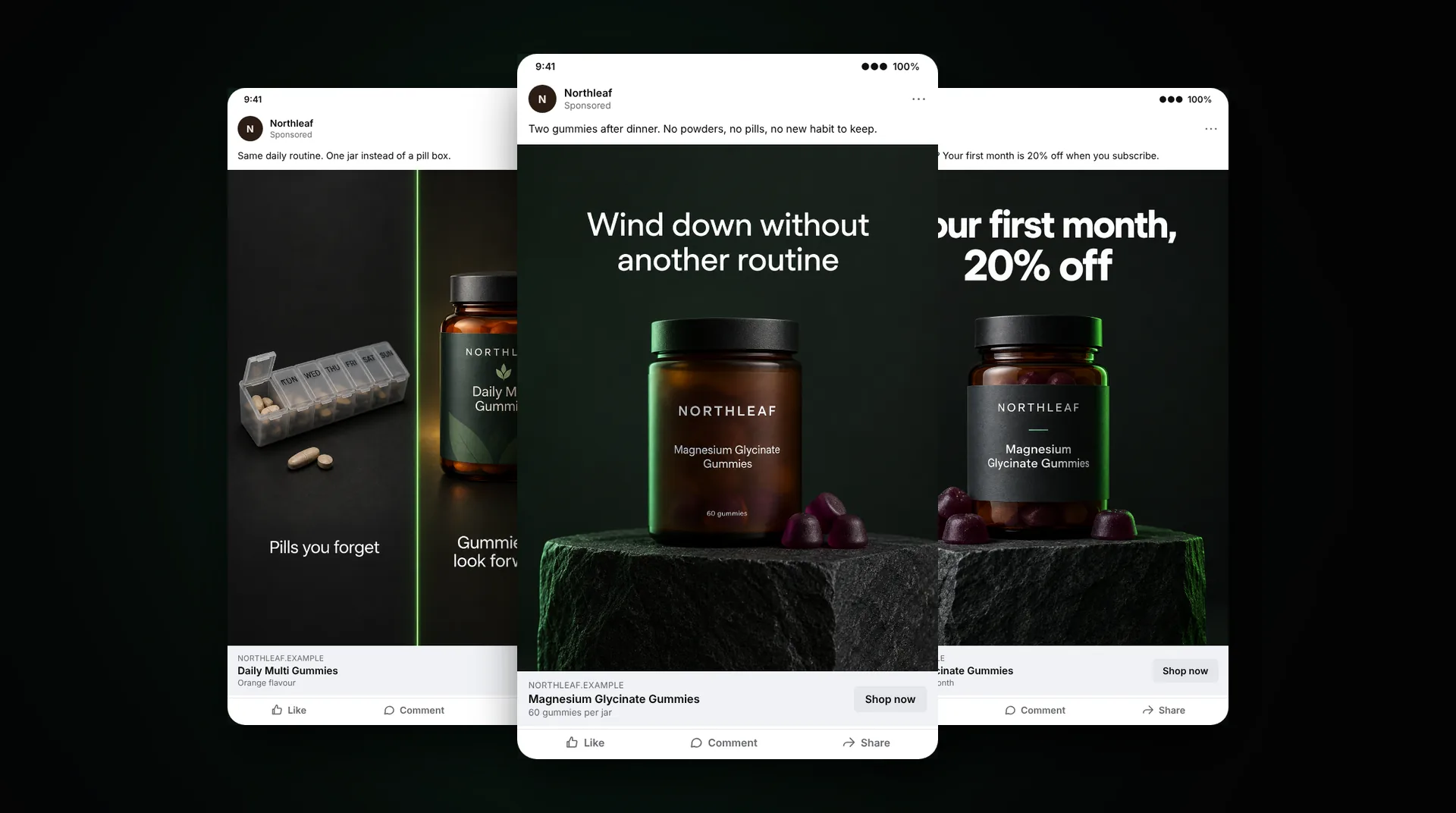
One benefit in large type, the product, and nothing else. Example: a magnesium gummy jar on a dark surface, with "Wind down without another routine" above it. Design it: the line should read in under two seconds on a phone, so keep it to six words or fewer and make the pack the second thing the eye lands on.
2. Problem headline
Opens on a situation the viewer knows, then shows the product as the change. Example: "3 pm and already on coffee number three?" over a greens powder pouch. Watch for: name the habit, not a health problem. Lines that assume the viewer has a condition are a common reason Meta rejects supplement ads.
3. Lifestyle moment
The product inside a real routine: next to the coffee machine, in a gym bag, on a bedside table. No headline needed. Design it: shoot it where your buyer actually uses it, and keep the label readable. This format often wins on retargeting because it looks like a photo, not an ad.
4. Ingredient spotlight
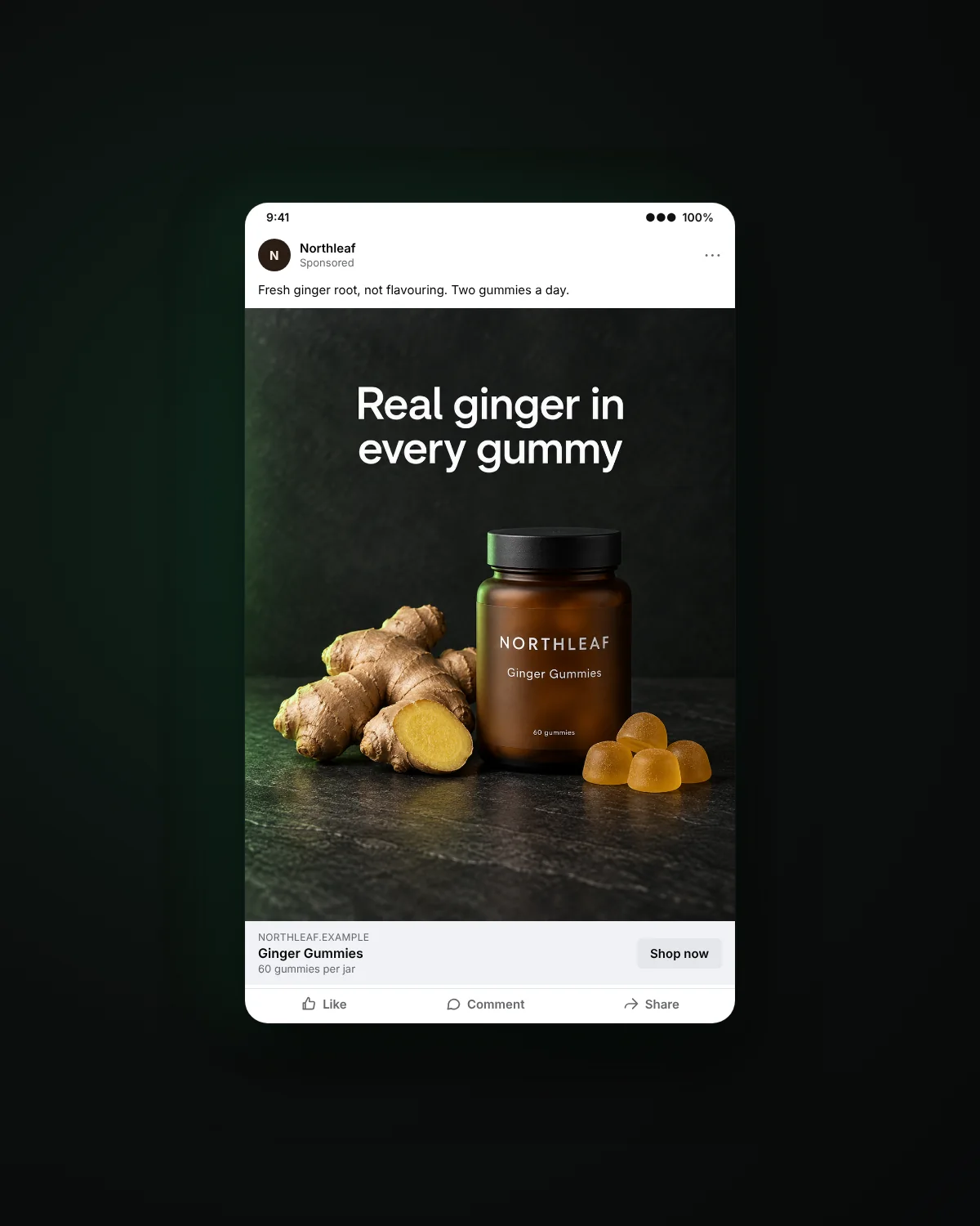
One ingredient and why it is there, in plain words. Example: fresh ginger root beside a ginger gummy, with "Real ginger in every gummy". Design it: show the ingredient next to the product at the same scale, so the link is obvious without reading.
5. What's inside
The pack with short labels pointing to what matters: form, dose, flavour, what it is free from. Watch for: every label must match the real pack. Pull the wording straight from the label, not from a brainstorm.
6. How to take it
Two or three steps that show how simple the routine is: "Two gummies. With breakfast. Done." Design it: number the steps and use the same product shot in each, so it reads as one routine, not three ads.
Static ads that answer doubts
These formats work for people who know the category and are deciding whether to switch or try.
7. This versus the usual
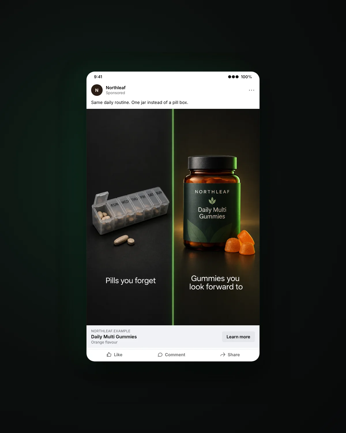
Your product on one side, the old routine on the other. Example: a gummy jar next to a pill organiser, with "Pills you forget" against "Gummies you look forward to". Watch for: compare against the habit, not a named competitor, and only state facts you can back up.
8. Routine before and after
Not the body, the routine. Left: five bottles on a shelf. Right: one daily pack. Watch for: keep bodies, skin and hair out of before-and-after images. Platforms treat them as implied results.
9. Objection answer
Takes the question buyers ask most and answers it on the image. Example: "Do they taste like medicine? No. Mango and passion fruit." Design it: use your real reviews and support emails to find the objection. The most common question makes the best headline.
10. Real review quote
A short quote from a verified review, the star rating from the store, and the product. Watch for: use real reviews only, with permission where your platform requires it, and never edit a quote so it says more than the customer did. Untypical results need to be clearly marked.
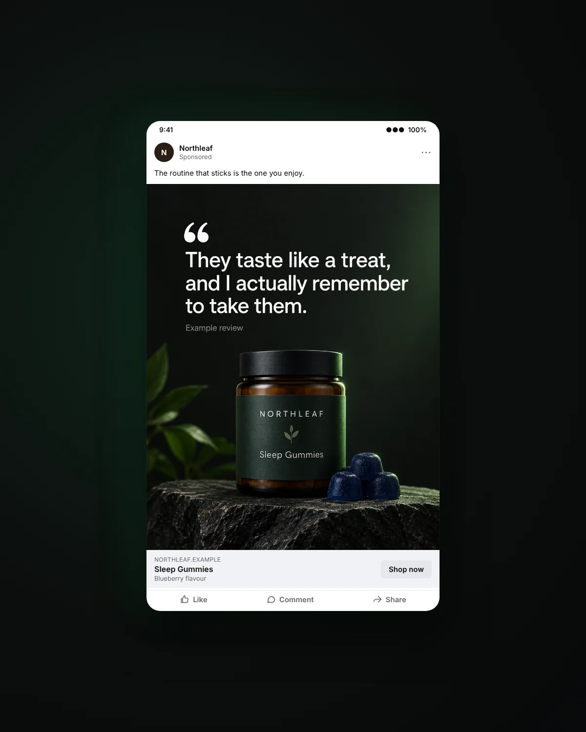
11. Founder note
A few lines from the founder on why the product exists, set like a handwritten card or a plain letter, with a photo of the founder or their hands. Design it: keep it personal and specific. One story beats a list of values.
12. Native note
Text-led statics that look like a phone note, a text message or a simple list: "Things I stopped doing this year: 1. Buying four separate supplements." Watch for: write them in the brand's voice. Never dress them up as a real customer's post or message.
Static ads that close the sale
These formats are for people who already know the brand. They should be the simplest ads in the account.
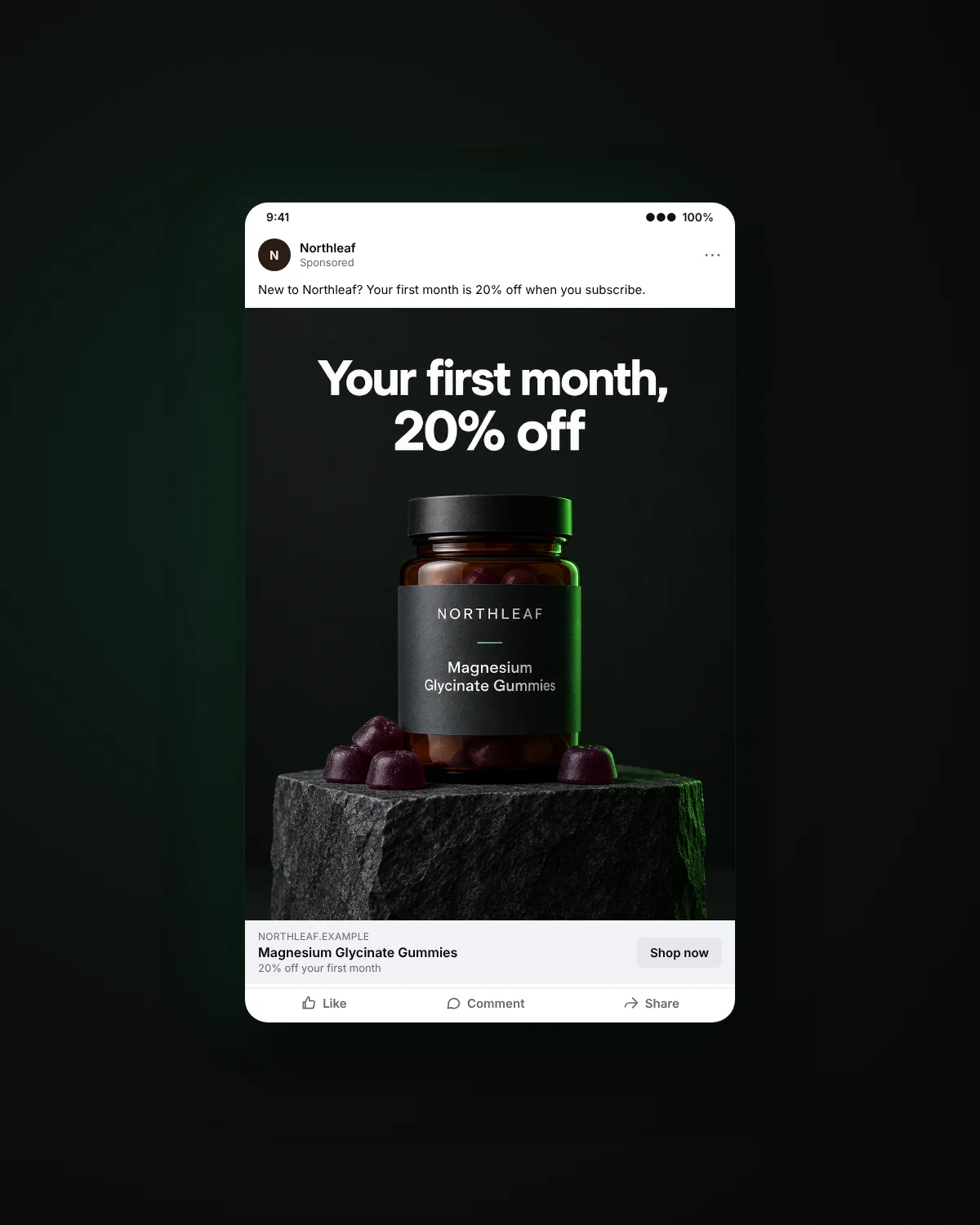
13. Clean offer
Product, one line with the offer, nothing else. Example: "Your first month, 20% off". Design it: the offer is the headline. If a second line is needed, the offer is not clear enough.
14. Bundle
Two or three products in a row with the bundle saving. Design it: line them up in the order people should use them, so the bundle reads as a routine, not a pile.
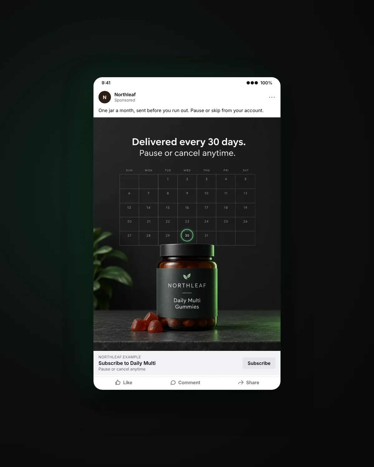
15. Subscribe and save
The product with the subscription terms people care about: "Delivered every 30 days. Pause or cancel anytime." Watch for: state the terms exactly as checkout does. A mismatch between the ad and the cart is a fast way to lose trust and invite chargebacks.
Static or video: when each wins
Pick by the job the ad has to do, not by what is easier to make.
| The job | Better as | Why |
|---|---|---|
| Test a new message or offer | Static | Fast and cheap to make in volume |
| Introduce a problem to cold audiences | Video | Needs a moment and a change over time |
| Show texture, taste or the product in use | Video | Motion sells what a still can only describe |
| Answer an objection | Static | One question, one answer, read in seconds |
| Retarget people who already visited | Static | They know the product; the offer does the work |
| Reach Amazon shoppers | Both | Sponsored Brands video and custom images serve different placements |
A good rhythm: test the message as a static, then make the winner into a video.
Sizes to deliver
| Placement | Ratio and size | Notes |
|---|---|---|
| Facebook and Instagram feed | 4:5, 1080 x 1350 | Meta's recommended feed image ratio; 1:1 still runs |
| Stories and Reels | 9:16, 1080 x 1920 | Keep the headline and product away from the top and bottom of the frame, where the app's buttons sit |
| Right column and Marketplace | 1:1 | Small on screen, so the product must read at thumbnail size |
| Amazon Sponsored Brands custom image | From 1200 x 628 | Amazon is strict about text on the image: no prices, offers or "best" claims. Check the current policy before upload |
Sources: Billo on Meta's 2026 safe zones, Jon Loomer on ratios by placement, m19 on Amazon creative requirements.
How to test static ads
- Start from one concept. Pick one idea and one audience, then make a batch of six to ten statics around it.
- Change one thing per variant. The headline, the image or the format. Change all three at once and you learn nothing.
- Read the right number. Click-through rate tells you whether the image stops people. Cost per purchase tells you whether the message sells. A static can win one and lose the other.
- Give it enough spend before you decide. Judge a variant once it has had a fair share of the budget, not after the first day.
- Refresh on a schedule. Statics are cheap to replace, so retire them before results slide. Our creative fatigue guide shows how to spot the slide early.
- Turn winners into briefs. The headline that wins becomes the hook of your next video.
For the full method, see our creative testing guide. For headline ideas, see 12 hooks that work for supplement brands.
FAQ
What are static ads?
Single-image ads with no motion or sound. One frame shows the product and a short line of copy, and the caption around it adds detail.
Do static ads still work on Meta?
Yes. Many accounts run more statics than videos, because statics are fast to test and strong for offers and retargeting. Your own results should decide the mix.
What size should a static ad be?
4:5 for Facebook and Instagram feeds, 9:16 for Stories and Reels, and 1:1 for small placements like the right column. Make each concept in all three.
How many static ads should I test at once?
Enough variants of one concept to compare one change at a time. Six to ten around a single idea teaches you more than ten unrelated ads.
Can I use AI to make static ads?
Yes, for backgrounds, scenes and variants built on your real product. Do not use AI to create customers, experts or reviews.
Can I use customer reviews in static ads?
Yes, if they are real, verified and quoted accurately. Never edit a review to say more than the customer did, and never write one.
See your product in these formats
Send one product link and we will make 10 ready-to-test static ads for your brand, handed over free on a 20-minute call within 5 business days.
Want statics every month? See our static image ads service.
Get my 10 free static ads